
How to Add Color to a Room: A Timeless Guide

Some rooms don’t look bad. They just don’t feel finished.
You might be sitting in one right now. The sofa works. The walls are safe. The rug is fine. But the whole space feels flat, a little borrowed, and not quite like you. That’s usually the moment people start searching for how to add color to a room and then get stuck between two extremes: play it too safe, or choose something bold and regret it.
Color doesn’t have to be a leap. It can be a series of smart, comfortable choices that fit your style, your budget, and your living situation. A homeowner may be ready for paint and wallpaper. A renter may need removable layers. A busy family may want durable color through furniture and washable textiles. All of those are valid ways to build a room with personality.
As someone who’s helped people make homes feel warmer, calmer, brighter, and more personal, I can tell you this. The best rooms rarely come from one dramatic decision. They come from a simple plan, a few confident anchors, and finishing touches that repeat the right colors in the right places.
A Timeless Welcome to a More Colorful Home
A lot of people think color is what designers do after the important decisions are done. In real homes, it’s often the opposite. Color is what makes the room feel welcoming, lived in, and personal.
Maybe you moved into a new place and everything still feels temporary. Maybe you inherited a room full of beige and don’t know where to begin. Maybe you like color in other people’s homes but freeze when it’s time to choose your own. That hesitation is normal.
Most color mistakes happen for a simple reason. People shop before they decide what feeling they want the room to have. They buy a bright pillow, then a patterned chair, then a rug in a different tone, and suddenly nothing connects.
A room usually feels colorful in a satisfying way when the colors relate to each other, not when every item tries to be the star.
That’s good news, because you don’t need an art degree or a perfect eye. You need a method that helps you make decisions one layer at a time.
Think of color as a story your room tells. A peaceful bedroom might lean soft and quiet. A dining room can handle more richness. A living room may need a mix of grounding tones and lively accents so it works for everyday life and guests alike.
If you’ve ever said, “I know what I like when I see it, but I can’t pull it together,” you’re in the right place. The process gets much easier once you stop trying to choose everything at once.
Start with a Plan Creating Your Color Story
A good color plan works like getting dressed with confidence. You start with the pieces that do the most work, then add the details that give the whole look personality.
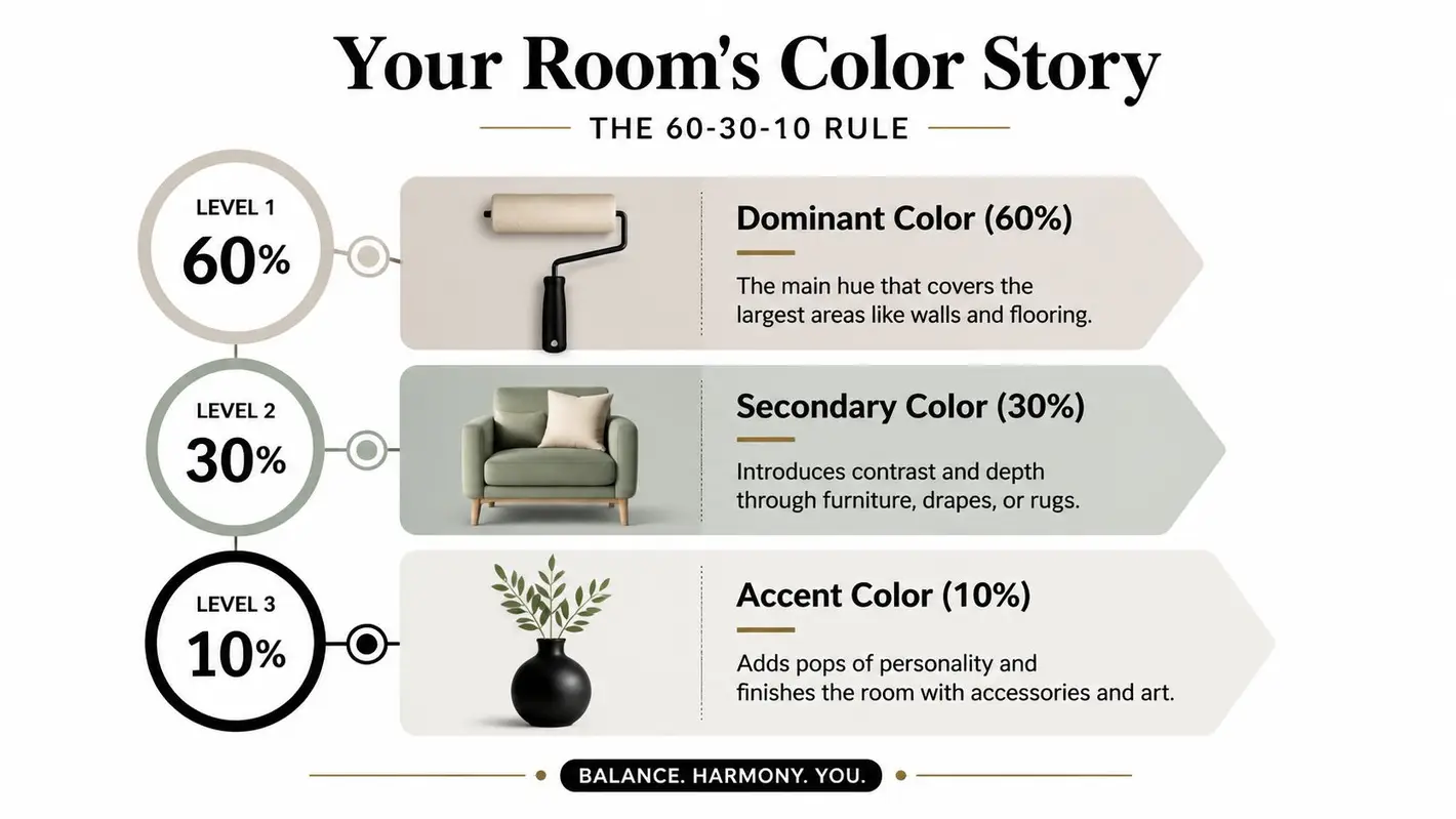
That is why designers return to the 60-30-10 Color Rule again and again. According to House Beautiful’s explanation of the 60-30-10 rule, 60% of a room’s visual space should be a dominant color, 30% a secondary supporting color, and 10% an accent color.
Think in layers, not in shopping lists
This approach helps because it gives each color a job.
Your dominant color usually covers the broad background of the room. That might be your walls, a large rug, or even a substantial sofa if you rent and cannot paint. Your secondary color adds shape and contrast through pieces like chairs, curtains, bedding, or case goods. Your accent color is the finishing touch, often seen in pillows, lamps, art, and tabletop decor.
If that still feels abstract, here is a simple way to read the room:
| Layer | What it often includes | What it does |
|---|---|---|
| 60% | walls, large rug, flooring, major backdrop | sets the overall tone |
| 30% | sofa, chairs, curtains, bedding | adds contrast and visual weight |
| 10% | pillows, throws, art, small decor | brings energy and focus |
This is especially helpful if you are trying to decide how bold to be. A homeowner might place the 60% color on the walls and keep furniture more grounded. A renter may reverse that plan and let a rug, sectional, or quilt carry more of the color story instead. Both approaches can look thoughtful and complete.
Pick the feeling before the shade
Color decisions get easier once you stop asking, “What color is popular?” and start asking, “What do I want this room to feel like when my family uses it?”
For a room that feels quiet and settled, start with softened blues, greens, warm grays, or sandy neutrals. For a space that feels welcoming and lively, look at clay, terracotta, ochre, muted coral, or deep golden tones. If you want something flexible enough to live with for years, especially in a larger purchase, begin with a steady base color and bring stronger shades in through the 30% and 10% layers.
A simple test helps. Picture the room at 7 p.m. after a long day. If the color would still feel comfortable then, you are probably on the right track.
Keep the palette simple enough to repeat
Many rooms feel confused for one reason. Too many colors are asking for attention at the same time.
Start with one of these three routes:
Monochromatic
Different shades of one color. This is a safe choice for bedrooms, small living rooms, and anyone who wants a calm result.Complementary
Opposite colors, such as blue and orange. This creates more contrast and works well when you want the room to feel energetic.Analogous
Neighboring colors, such as blue and green. This usually creates a softer, blended look.
If you are unsure which route fits your home, save three room photos you keep returning to. Then look for repetition. You will often notice the same pattern. A quiet base, a stronger supporting color, and a few smaller accents that keep the room from feeling flat.
For more help matching hues and undertones, browse this expert guide to the perfect color palette. It is a useful companion when you want to narrow your options before committing to paint, upholstery, or renter-friendly accents.
Making a Statement with Paint and Wall Treatments
Walls carry a lot of visual weight, so they’re often the strongest place to introduce color. If you own your home and want the biggest transformation, paint is usually the fastest path.
Still, people often get nervous. Paint feels permanent, even when it isn’t. The fix is to make smaller decisions before you make bigger ones.
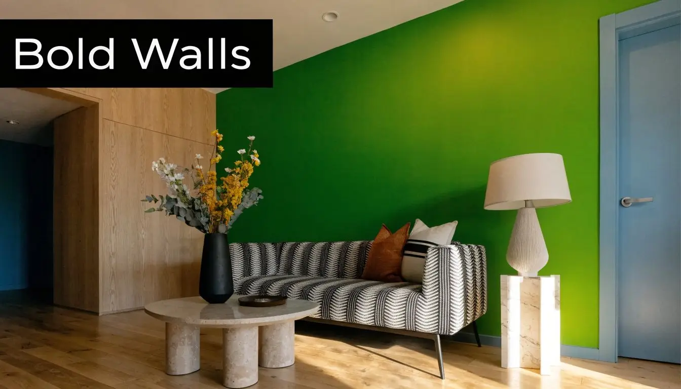
Start with the wall that matters most
You don’t have to paint every wall in a strong shade. In many rooms, one surface does the work beautifully.
Good candidates include:
- The wall behind the sofa because it frames the main seating area
- The wall behind the bed because it creates a natural focal point
- The dining room end wall because it adds depth and presence
- A fireplace wall because it already has architectural importance
An accent wall works best when it looks intentional. If the room has an obvious focal point, use it. If it doesn’t, creating one with color can bring order to the space.
Look beyond the standard four walls
Some of the most polished rooms use color in slightly unexpected places.
A painted ceiling can soften a bright room or make a plain one feel considered. Interior doors in a deeper tone can add contrast without filling the whole room with color. Trim in a subtle variation of the wall color can feel rich and modern.
Here’s a quick comparison:
| Surface | Best for | Visual effect |
|---|---|---|
| Main walls | full room transformation | strongest color impact |
| One accent wall | testing bolder shades | creates a focal point |
| Ceiling | adding intimacy or interest | draws the eye upward |
| Doors or trim | refined contrast | gives the room definition |
Test in your own light
Paint chips lie more often than people expect.
A color that looks soft in the store can turn cool, muddy, or too intense once it’s on your wall. That’s why testing matters. Tape up larger samples and look at them in morning light, afternoon light, and lamplight. If a room connects to another room, test the colors where the spaces meet.
A good paint color doesn’t just look nice alone. It needs to work with your flooring, your wood tones, and the furniture you already own.
If you want extra help thinking through undertones and room flow, read this guide to picking the perfect paint color for your home. It’s especially helpful if you tend to overthink samples or keep circling between “safe” and “too bold.”
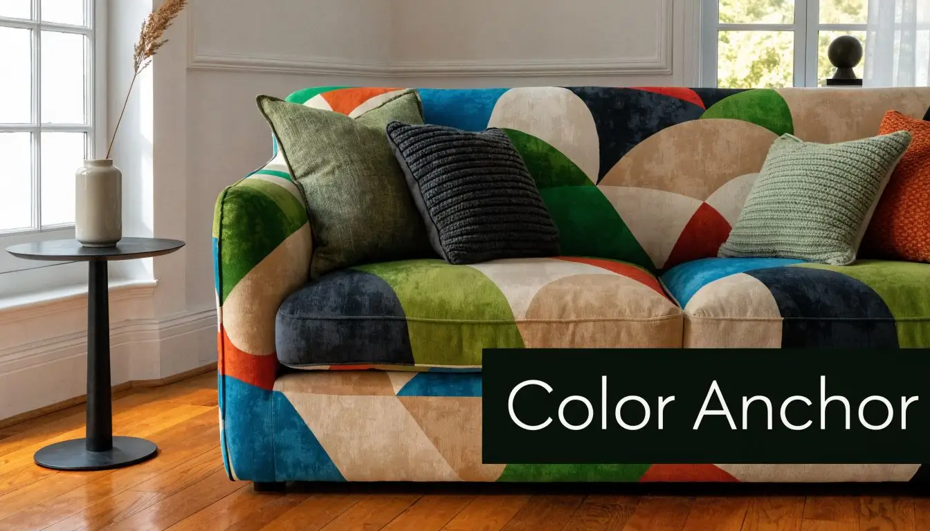
Choosing Furniture as Your Color Anchor
A room often finds its color identity through furniture long before the finishing touches go in. In many homes, the sofa, bed, or dining set acts like the steady note in a song. Everything else either harmonizes with it or competes with it.
A white room with a navy sofa feels well-composed and grounded. The same room with a camel sofa feels warmer and quieter. Green dining chairs can make a breakfast area feel fresh and lively, while natural wood keeps the mood softer and more traditional. That is why furniture color deserves careful thought. It usually stays with you longer than paint, pillows, or seasonal decor.
Decide how much commitment feels right
This choice gets much easier when you sort furniture into commitment levels.
If you own your home and you know the color direction you love, a sofa, upholstered bed, or set of dining chairs can carry that color confidently for years. A deep blue sectional, a rust bed, or olive dining chairs can become the center of the room’s whole story.
If you like flexibility, or you are furnishing a rental, let a smaller piece carry the stronger color. A swivel chair, accent bench, painted bookcase, or storage cabinet can bring personality into the room without locking you into one look for the next decade. Browse accent furniture for living rooms if you want ideas that add color without requiring the commitment of a full sofa replacement.
Choose whether the main piece should lead or support
A large furniture piece can do one of two jobs. It can lead the palette, or it can support it.
A leading piece usually draws the eye first. Examples include:
- a blue sectional
- a green accent chair
- a rust upholstered bed
- a patterned sofa with two or three related colors
A supporting piece gives you more room to change accessories later. That might be:
- a warm beige sofa
- a charcoal recliner
- a wood dining table with color added through the chairs
- a neutral bed frame paired with richer bedding and artwork
Neither approach is more stylish. The better choice depends on how often you like to refresh a room and how confident you feel about living with color every day.
Match the furniture color to the room’s job
Color works best when it supports how a room is used.
Living rooms can usually handle a stronger sofa color because the upholstery takes up so much visual space. Dining rooms are a great place for colorful chairs because they add personality in a controlled way. Bedrooms often feel best with color focused on the bed, bench, or one upholstered chair rather than spread across every surface. In a home office, a calmer furniture color often helps the room feel settled and easier to work in.
As noted earlier, cooler hues are often associated with calm and focus, while warmer tones tend to feel more energetic and social. That does not mean every productive room should be blue or every gathering space should be red. It means the furniture color should support the room’s purpose instead of fighting it.
Buy for the years after the first impression
The boldest color in the showroom is not always the right one for your home. A better test is this: will you still enjoy it on an ordinary Tuesday six months from now?
That question has guided families for generations, and it still matters. In a business that has helped people furnish their homes for more than 170 years, one truth keeps holding up. The best furniture color is the one that fits your life, your light, and your comfort level. Sometimes that means a statement sofa. Sometimes it means a neutral foundation with one colorful chair. Both can be smart choices when the piece is well made and chosen with care.
The most successful furniture color is the one you will still be happy to come home to after the novelty wears off.
Weaving in Color with Textiles and Accessories
Not every room needs a new sofa or a gallon of paint. Sometimes color arrives through the layers that make the room feel soft, personal, and complete.
Textiles are especially useful because they change the emotional temperature of a space quickly. A neutral room can feel coastal, earthy, refined, playful, or cozy just by changing the rug, pillows, throws, curtains, and bedding.

Use the Rule of Three
If your accent colors always look scattered instead of styled, repetition is probably the missing piece.
According to Julie Ann Rachelle’s discussion of the Rule of Three in decorating, repeating an accent color in odd numbers across different scales creates cohesion. The same source notes that even-numbered repetitions can reduce perceived harmony by up to 50%.
That sounds technical, but the idea is simple. Don’t let one color appear only once.
Try a color like terracotta in three places:
- a lumbar pillow
- a piece of wall art
- a ceramic vase on a side table
Or repeat olive green through:
- a throw blanket
- curtain panels
- a patterned ottoman
Mix texture before you add more colors
A room can feel richer without introducing another hue.
If your palette already works but still feels flat, vary the materials:
- velvet pillow with woven throw
- wool rug with linen drapery
- quilted bedding with a printed cushion
- matte pottery beside polished metal
Texture helps the same color read in different ways. Navy velvet, navy cotton, and navy wool won’t feel repetitive. They’ll feel layered.
Make the bed or sofa your color testing ground
For many people, pillows are the easiest low-risk starting point.
A simple formula works well:
- start with one solid pillow in your main accent
- add one patterned pillow that includes that color
- finish with a different texture in a related tone
That’s one reason curated pillow groupings look more intentional than single impulse purchases. If you want ideas for shape, scale, and mix, see the best throw pillows for a couch.
Small accents work best when they echo each other. One bright object looks random. Three connected accents look deliberate.
A colorful room doesn’t have to come from expensive changes. A new rug under the coffee table, drapery that picks up a tone from the artwork, or fresh bedding with a stronger accent shade can shift the whole mood of the home.
Clever Color Solutions for Renters and Compact Rooms
Some of the best color strategies come from constraints.
Renters can’t always paint. Smaller rooms can’t always handle heavy contrast. But those limits often lead to smarter decorating because every choice has to work harder.
A renter-friendly room depends on movable color. A compact room depends on focused color. Put those together and you get a practical approach that works for a lot of real homes.
Renter-friendly color that can move with you
Many design guides still assume you can repaint every wall. That leaves out a huge group of people. A Homes & Gardens summary citing Zillow data notes that 31% of U.S. adults rent, and the same piece highlights a 40% increase in sales of non-permanent solutions like fabric panels and tension-rod curtains.
That points to a clear lesson. If you can’t change the shell, change the layers.
Good renter-friendly options include:
- Large rugs that introduce the main color underfoot
- Curtains on tension rods for a broad vertical block of color
- Removable fabric panels behind a bed or sofa
- Colorful bookcases or accent cabinets that act like movable architecture
- Oversized art that gives the eye a focal point
Make small rooms feel intentional, not crowded
In compact spaces, color works best when it’s concentrated instead of scattered.
Choose one main direction and repeat it. For example, if your room leans warm, carry that through a rust pillow, wood side table, patterned rug, and lamp shade with a related tone. If the room is cooler, repeat blue-green in bedding, drapery, and one upholstered piece.
A few useful habits help in smaller rooms:
- Keep the base calm so the room has somewhere to rest
- Let one larger item hold the strongest color rather than using many tiny bright pieces
- Use height with curtains, art, or shelving so color travels upward
- Limit unrelated accents because random pops can make the room feel busy
Choose items that solve more than one problem
Practical shopping matters. In small homes and apartments, the best colorful pieces usually earn their spot by doing double duty.
A storage bench can add upholstery and hide clutter. A patterned ottoman can bring in color and provide a footrest. A bold table lamp can brighten a dark corner and complete the palette. Color feels more successful when it also supports the way you live.
If you’ve been waiting for permission to skip paint and still make your room feel finished, here it is. Furniture, textiles, and removable treatments can carry plenty of personality on their own.
Your Colorful Home Awaits
Color works best when it feels personal, not forced.
Start with a plan. Choose the mood you want. Give the room one strong anchor. Finish with repeated accents that connect the whole space. That’s the difference between a room that has color and one that feels put together.
You don’t need to commit to everything at once. One painted wall, one upholstered chair, one new rug, or one better pillow mix can move the room in the right direction. The goal isn’t perfection. It’s a home that feels more like yours each time you walk in.
If you’re still unsure, trust the slower method. Test. Edit. Repeat what works. Color should feel enjoyable, not stressful.
If you're ready to turn ideas into a room you love, shop Short Furniture for living room sets, bedroom furniture, dining tables, mattresses, and home accents that make color feel easy to live with. Browse the latest arrivals online, ask about flexible financing options, count on reliable delivery, and take advantage of complimentary design consultations backed by a family-owned Illinois business that’s served customers since 1870.