

How to Style a Bookshelf: Expert Tips

That bookshelf in the corner usually falls into one of two camps. It’s either half-empty and awkward, or it’s carrying paperbacks, mail, chargers, and a candle you forgot you owned.
The good news is that learning how to style a bookshelf isn’t about copying a showroom display. The best shelves feel gathered over time. They hold books you read, objects you care about, and enough breathing room for the whole arrangement to feel calm instead of crowded.
Designers have leaned hard into this idea lately. The “bookshelf wealth” trend became one of Google’s top interior design queries in 2024, and designers reported a 40-50% increase in requests for wealth-inspired library styling, a sign that curated shelves now communicate personal taste more clearly than a single statement chair or table, as noted by Domino’s coverage of Google’s 2024 interior design search trends.
From Blank Shelf to Beautiful Story
A well-styled bookshelf changes the whole room because it does two jobs at once. It gives the eye a focal point, and it tells people something honest about who lives there.
That’s why the best shelves don’t feel sterile. They’re edited, yes, but they aren’t stripped of personality. A child’s framed sketch, a brass box from a trip, a stack of novels with worn edges, a ceramic bowl you use nowhere else. Those details matter more than chasing a perfect catalog look.
A bookshelf should look collected, not installed.
The most common mistake is treating every shelf as its own little stage set. That approach often creates displays that feel stiff and disconnected. A stronger result comes from thinking about the whole piece as one story, with a little rhythm, a little contrast, and a few pauses where the eye can rest.
A lived-in shelf also has practical value. It can soften a living room, add warmth to a home office, or make a hallway feel intentional instead of forgotten. If you’ve been staring at a blank unit and wondering where to begin, start with this idea: you’re not filling shelves. You’re shaping a visual autobiography.
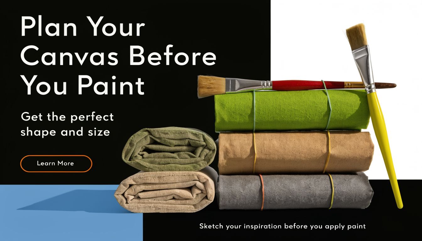
Plan Your Canvas Before You Paint
Good styling starts before the first book goes on the shelf. If the setup is wrong, no amount of arranging will make it feel settled.
Measure the shelf and the space around it
Measure the bookcase itself, but also look at what surrounds it. A shelf pressed too tightly against a doorway, window trim, or large sofa can feel cramped before you style a single inch.
Check these basics first:
- Shelf depth: Deep shelves can hold layered frames, boxes, and bowls. Shallow ones need a lighter hand.
- Vertical spacing: Tall shelves welcome vases, branches, and larger art. Short shelf openings need lower profiles.
- Nearby furniture: A bookshelf beside a media console, sectional, or desk should relate to those pieces in finish, scale, or tone.
If the room already feels busy, choose a simpler silhouette. If the room is plain, a bookshelf with more character can carry the corner.
Pick a clear direction
Before styling, decide what role the bookshelf will play. Some shelves are mostly for reading. Others are display-forward. Most family homes need a blend of both.
This quick guide helps:
| Shelf role | Best approach |
|---|---|
| Book-heavy library look | Use more uniform rows and restrained accents |
| Decorative focal point | Mix books with art, objects, and open space |
| Family storage with style | Add baskets, boxes, and durable objects |
| Work-from-home support | Leave room for binders, trays, and practical storage |
Color planning matters too. Pull a small palette from the room so the shelf belongs to the space. A rug, accent chair, drapery, or piece of wall art can give you the tones you need. If you want help refining those colors, this guide on how to add color to a room is a useful place to start.
Practical rule: If every object on the shelf comes from a different color family, the shelf reads as clutter before anyone notices the individual pieces.
Edit before you style
Clear everything off the shelves first. Then sort what you own into simple groups.
- Books: Keep the titles you use, love, or want visible.
- Meaningful objects: Souvenirs, heirlooms, framed photos, handmade pottery.
- Useful storage: Lidded boxes, baskets, magazine files.
- Filler you can skip: Tiny items with no purpose, duplicate decor, random leftovers from other rooms.
This step saves time. It also keeps you from forcing things onto the shelf just because they exist.
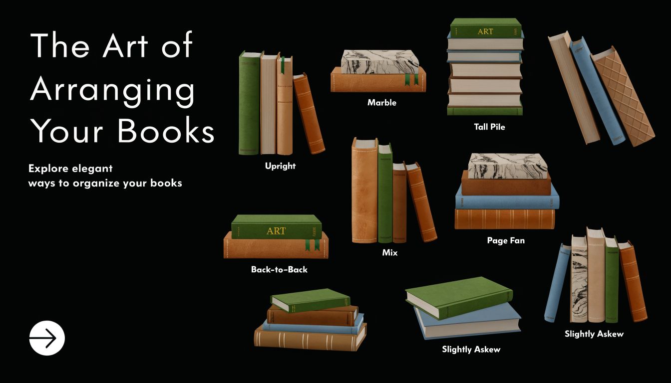
The Art of Arranging Your Books
Books are the backbone of the arrangement. If they go on the shelf without a plan, everything added afterward will look like an afterthought.
Start with the 70-30 balance
The most reliable place to begin is the 70-30 Rule. Professional stylists recommend 70% of shelf space for books and 30% for objects and negative space, because that balance keeps shelves from reading as pure storage or as overfilled decor displays, according to Kevin Francis Design’s bookshelf styling guide.
That ratio works because books bring structure. They create lines, weight, and visual steadiness. Decorative pieces then break up that structure and keep it from feeling flat.
In practice, don’t aim for mathematical perfection. Aim for the feeling of a shelf grounded by books, with room left for life around them.
Mix standing rows with horizontal stacks
A full line of upright books can look neat, but it often feels rigid. Horizontal stacks soften the pattern and create platforms for smaller objects.
Use both.
- Vertical books give the arrangement order and height.
- Horizontal stacks interrupt repetition and create resting places for bowls, boxes, or small framed photos.
- Larger and heavier books belong lower down, where they anchor the whole piece visually.
If a shelf looks too busy, reduce the number of stacks. If it feels too stiff, add one.
Think in clusters, not in single titles
Books look better when they relate to one another. Group them by tone, size, or subject so each section feels intentional.
Some pairings that work well:
- Neutral hardcovers together for a softer, quieter shelf
- Art and design books in one zone because their scale often matches
- Children’s books in a lower section where color feels playful and access is easy
- Cookbooks grouped in a dining area or kitchen-adjacent room for both use and display
If you enjoy styling other surfaces with the same collected feel, this article on the perfectly styled coffee table uses a similar approach to balance and layering.
Don’t hide every sign of use. A shelf gains warmth from books that look handled, loved, and reread.
What doesn’t work
A few arrangements almost always disappoint:
| What goes wrong | Why it falls flat |
|---|---|
| Every book lined up at the same height | The shelf looks static |
| Too many tiny stacks | The eye jumps around without settling |
| All decorative books, no personal titles | The shelf feels staged |
| Books jammed edge to edge | There’s no space for rhythm |
The goal isn’t perfection. It’s a book arrangement with enough order to feel composed and enough variation to feel human.
Layering Objects for Balance and Rhythm
Once the books are in place, objects give the shelf its personality. At this point, the display stops looking like storage and starts feeling designed.
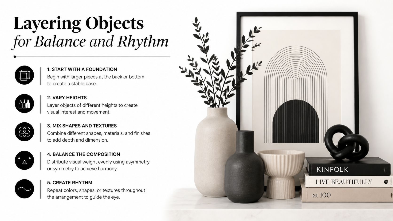
Use the rule of thirds
Designers often use the Rule of Thirds, dividing shelves into a grid and placing key pieces near those intersections instead of dead center. They also use diagonal repetition, such as echoing a brass accent from the upper left to the lower right, to create movement across the whole bookcase, as described by LuxeSpace Design’s expert bookshelf styling tips.
You don’t need to draw a grid. Just avoid centering every vase, frame, and bowl. Slightly off-center placements usually feel more relaxed and natural.
Build small scenes
The easiest way to style objects is to think in vignettes. A vignette is a small grouping that reads as one visual moment instead of several unrelated things.
Try combinations like these:
- A framed photo behind a small ceramic bowl
- A candle beside a short stack of books
- A sculptural object on top of two hardcovers
- A box with a bead strand or small natural object beside it
Odd-numbered groupings tend to look more appealing than even ones. Three objects usually feel easy and balanced. Five can work on a longer shelf if there’s still breathing room.
Repeat materials across the whole unit
A shelf looks cohesive when a material or shape appears more than once. If you use black metal on one shelf, let it show up again elsewhere. If you have a round shape at the top, echo a curve lower down.
This doesn’t mean matching everything. It means giving the eye something familiar to track as it moves.
Here’s a simple rhythm guide:
| Element to repeat | Good examples |
|---|---|
| Finish | Brass, matte black, white ceramic |
| Shape | Round bowls, arched frames, cube boxes |
| Material | Glass, wood, rattan, stone |
| Motif | Botanical art, travel pieces, handmade pottery |
Shelves feel finished when the eye can travel across them without getting stuck.
Vary height and visual weight
Not every object should shout for attention. A tall vase can carry one side of a shelf, while a lower, wider object can quiet the other side.
Use contrast on purpose:
- Pair something tall and narrow with something short and broad
- Put a light visual object near a solid, grounded piece
- Let one item lead, then give it supporting pieces instead of rivals
What usually fails is using too many similarly sized accessories. When every object is medium height and medium interest, the shelf goes flat.
A good shelf has hierarchy. One piece leads. Another supports. A third softens.
Adding Life with Texture and Greenery
A shelf filled only with books and hard decor can look competent and still feel cold. Texture is what makes it inviting.

Mix materials that push against each other
Professional stylists use texture stratification by combining materials like smooth ceramics, woven baskets, and metallic finishes. That contrast creates depth and helps prevent visual monotony, and books can double as risers to lift smaller accessories for stronger height variation, as explained by Hamilton Park Interiors’ shelving guide.
That idea matters because shelves are viewed quickly. Texture helps each item stand apart.
Strong pairings include:
- Glossy ceramic with rough wood
- Leather-bound books with glass
- Woven baskets with metal frames
- Fabric-covered boxes with stone or concrete objects
Bring in something living
Greenery breaks the rigid lines of shelving. A trailing plant, a compact potted shape, or even quality faux stems can loosen the arrangement and make it feel less staged.
Some of the easiest options are:
- Trailing vines on an upper shelf
- Small upright plants tucked beside books
- Seasonal branches in a simple vase
- Faux greenery in lower-light corners
If you’d like ideas that work well with furniture and shelf styling, this roundup of trendy houseplants to complement new furniture offers practical inspiration.
A room starts to feel lived in when at least one object looks like it came from nature instead of a factory.
Use softness to hide the practical side of life
Texture isn’t just decorative. It solves problems. A woven basket on a lower shelf can hold toys, chargers, or spare throws. A fabric box can corral office supplies without turning the shelf into open storage.
This is often the difference between a shelf that looks lovely for a day and one that works for a real household. Beauty holds longer when it has a job to do.
Styling Shelves for Every Room and Home
The same formula won’t suit every room. A shelf in a living room has a different job than one in a home office or apartment bedroom.
In the living room
A living room bookshelf usually carries the most visual weight. It may sit beside the fireplace, frame a television, or anchor a reading corner.
That shelf should feel generous and relaxed. Novels, art books, family photos, a bowl for collected objects, and a bit of greenery all belong here. Leave enough open space that the arrangement doesn’t compete with the sofa, cocktail table, lamps, and other larger pieces in the room.
A useful check is this: if the bookshelf is louder than every other element in the living room, it needs editing.
In the home office
A home office shelf needs more discipline. Beauty still matters, but usefulness matters just as much.
Keep the workhorse items together so they don’t interrupt the display:
- Reference books and binders in one area
- Boxes or baskets for cables, notebooks, and supplies
- A small framed piece or plant to soften the practical side
- Clear open space so the shelf doesn’t feel crammed beside a desk
For a look that blends storage and style, a simple, versatile piece like the Janismore bookcase works well because it gives you room to combine display items with everyday function.
In rentals and budget-conscious homes
A common failing of many styling guides is that renters and budget-conscious families are an underserved audience in shelf styling content, and Pinterest data shows a 40% rise in searches for renter-friendly shelving hacks, reflecting the need for flexible, non-permanent solutions, as noted in this discussion of lived-in bookshelf styling and renter needs.
That means perfection isn’t the goal. Flexibility is.
What works best:
| Situation | Better choice |
|---|---|
| Frequent moves | Freestanding bookcases |
| Tight decor budget | Use books, framed snapshots, pottery, and found objects |
| Shared family spaces | Durable baskets and fewer fragile toppers |
| Small apartments | Lighter styling with more open space |
A rented home doesn’t need built-ins to look polished. In fact, movable shelves often feel more personal because they evolve with each space.
The Final Edit and Keeping It Fresh
The last step is the one people rush. It’s also the step that makes the shelf look finished.
Walk away for a few minutes, then come back and look at the whole bookcase instead of one shelf at a time. Check for crowding, repeated colors, and whether your eye moves comfortably from top to bottom.
A fast editing checklist helps:
- Remove one item from any shelf that feels busy
- Shift anything too centered
- Spread similar colors across the full unit
- Move the heaviest visual pieces lower
- Make sure meaningful objects aren’t buried by filler
If a shelf feels off and you can’t tell why, it usually needs less, not more.
Living with the arrangement for a few days helps. You’ll notice what bothers you. A stack may feel too tall. A frame may block a favorite title. A plant may want better light. Good styling isn’t a one-time performance. It’s an ongoing adjustment.
To keep the shelf looking fresh, dust it regularly and rotate a few pieces with the seasons or as your life changes. A new framed photograph, a recent read, or a bowl picked up on a trip can refresh the whole display without starting over. That’s the beauty of a personal shelf. It grows with the home.
If you’re ready to turn an empty corner into a polished, personal feature, browse Short Furniture for bookcases, home accents, living room furniture, home office pieces, dining tables, bedroom furniture, and mattresses that make every room work harder and look better. As a family-owned Illinois furniture store serving customers since 1870, Short Furniture pairs long-standing trust with online convenience, offering flexible financing options, reliable delivery, and complimentary design consultations to help you choose the right pieces with confidence. Shop the collection, browse the latest arrivals online, or apply for financing today.